Building Phomo, Part 1: The Calendar
Implementing a calendar image gallery in React Native
Introduction
I recently published phomo, my first mobile app, to the App Store (it’s free, by the way!) I started working on phomo last summer with a simple idea: I take the same type of photo every day, and I wanted to make capturing and organizing those images more convenient and more fun.
The project gradually grew more complex as I kept thinking up additional features. Some of those were straightforward to implement or had existing open-source solutions, but others took a little more ingenuity and effort. I learned a lot by solving those problems, and I’ll be sharing some of what I learned in this series of articles. The plan is to start with a blank slate and incrementally work through some of the app’s functionality.
If you’re a programmer, or just interested in how apps are made, this will be up your alley. I’m going to assume familiarity with JavaScript and React so as to keep the focus on the application logic, but I’ll try to include links for further reading where I can. If you want to see where we’re going to end up, here’s the working demo. It runs on iOS, Android, or the web. This is what the demo looks like on an iPhone:
Let’s dive in!
What Are We Building?
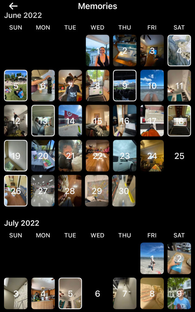
The first thing I built in phomo was the calendar view, and that’s where we’ll start today. The objective was to create an image gallery that loads the photos from a selected album on the user’s device and displays them on a vertically scrolling calendar, with each image displayed on the date it was taken. Pressing on an image should open a detail view. BeReal has a view like this:
As does Instagram:
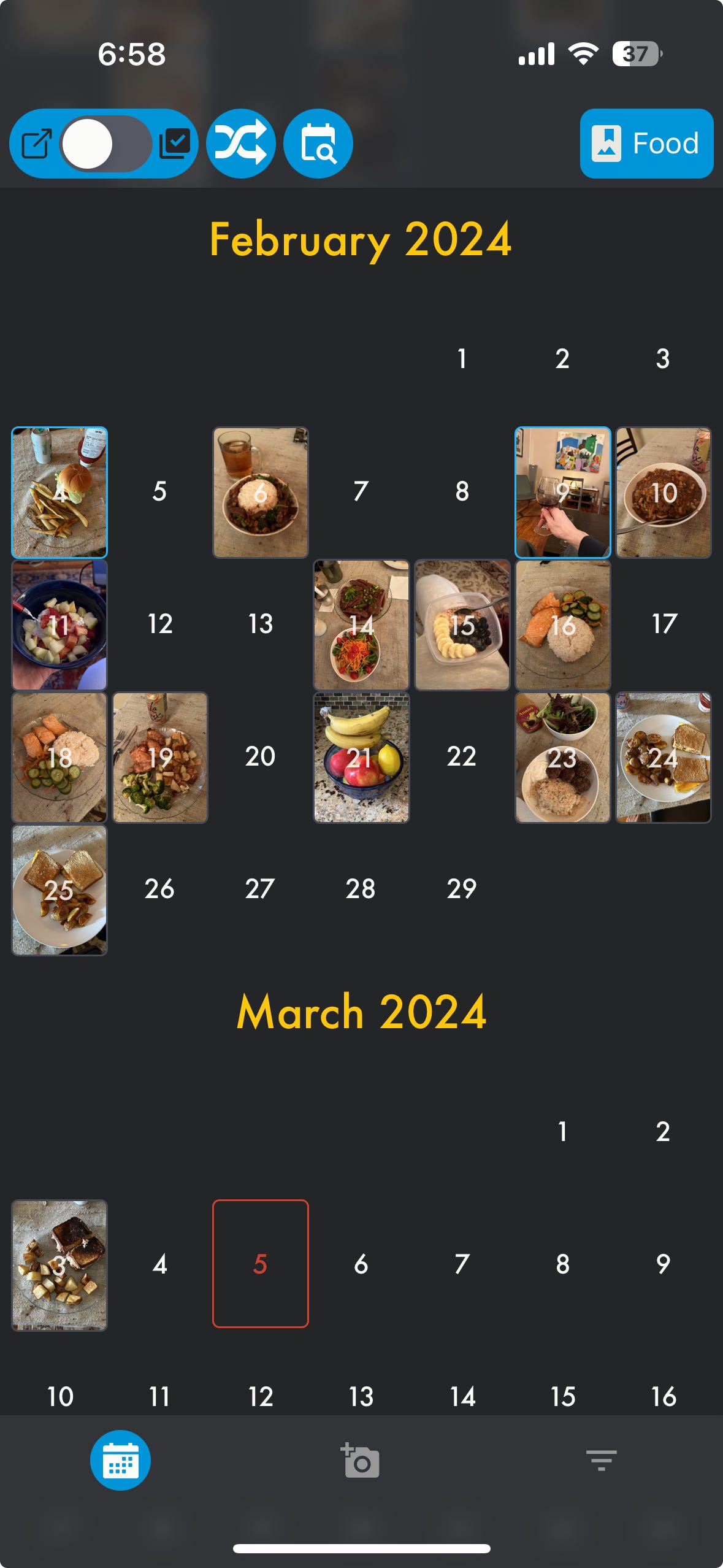
And here’s a screenshot of the finished product in phomo:
Looking for a Lib
There are lots of great open-source libraries for React Native, many of which helped me immensely on this project. I was confident I could find a calendar library, and after a little research, I found React Native Calendars from wix.
At first glance, the library’s CalendarList component seemed like a perfect solution. The calendar’s styling was customizable, and I could use its dayComponent prop to display images on their respective dates. I installed the library and quickly had something up and running that resembled my end goal.
But as I spent more time with it, I found myself running into difficulties with the library.
Performance:
react-native-calendarsis based on React Native’s built-in FlatList component, which is a virtualized list — that means that it renders only the list cells that are currently in view and forgets about the rest, which is a performance optimization compared to keeping all list cells in memory at all times. However, FlatList isn’t perfect for all situations, and I found the rendering speed unacceptably slow when scrolling quickly through large albums.Range: The CalendarList component can only render a maximum of 4 years into the past or future. My app needed to handle albums potentially spanning more than that.
Fixed month height: The CalendarList component allows the month height to be defined as a prop, but that height will be the same for every month. So the only viable option is to provide the height for a 6-row month, meaning there will be blank space between months any time a month has fewer than 6 rows.
Empty months: The CalendarList component will display a user-defined range of dates. But every month in the range will always be rendered, even if it has no data. A better experience would be to only render a calendar month if it contained images.
None of this is to say that react-native-calendars is a bad library; it simply wasn’t ideal for my situation. After struggling for awhile to make the library do what I wanted, including making some modifications to its internals, I decided it would be more efficient to start from scratch. Fortunately, that turned out to be more straightforward than I’d initially feared.
Rolling My Own
At the highest level, a calendar is just a grid with some special properties. There are two basic types of cells in our grid: header cells and day cells. Headers need to be 7 columns wide, and days 1 column wide. There are three subtypes of day cell: days that have an image; days that don’t have an image; and “blank” day cells needed to pad the beginning or end of a month so that the weekdays stay in the correct columns.
Two libraries are going to be especially helpful for this task: Shopify’s FlashList for the grid, and date-fns to deal with date logic.
The basic approach will be as follows:
Load images
Use
date-fnsto transform the image data into a structure that can power the gridCreate components to render each of the cell types
Feed the data to a
FlashList, using our components as the renderItem
Getting the data
Our first task is to load the images we want to display. In the demo we just load a bunch of remote images from a static JSON file, but in phomo I used getAssetsAsync from expo-media-library. That function resolves with an array of Assets, which will look like this:
We only care about a few properties here — the creationTime, which we use to assign the image to a calendar date, the id, which we use as a unique key for the image, and the uri, which we use to actually display the image.
We use a reduce function to format the array of Assets into an object we can work with. In the demo project, that looks like this:
formatISO is a function from the date-fns library that takes a JavaScript Date object and returns a string conforming to the ISO 8601 standard. When we pass {representation: ‘date’} in the options, it outputs a string in YYYY-MM-DD format.
In the production app this gets stored in Redux state so it can be accessible throughout the app and get updated when we add or delete images.
Transforming the data
First, let’s envision the output that we want from our transformer function. In order to render the list, we need an array of objects sorted by date. The objects will have to have a type property and some optional data to represent the day of the month and the image object. Something like this:
In the demo, the function that does this is transformImagesToCalendarData, in utils.js. It’s composed of several sub-functions:
First we grab just the images from our imagesByDateString object and pass those to makeSortableMonths, which is another reduce function. It returns an object whose keys are strings representing each month containing 1 or more images in our data. The keys will be formatted the way we want the calendar headers, e.g. ‘March 2024’. The values are timestamps of some image within the month. Which particular timestamp it is doesn’t matter; we only care that it’s within the month. This allows us to sort the months, and to determine other properties of the month later on.
Next, we make sure that the current month is in the list; this isn’t actually necessary for the demo app, but in the full app pressing today’s date opens a camera screen, so it should always be rendered. Then we put the months in order, sorting on the timestamps which are the values of the months object. makeMonthList creates the array of objects for the days of the month, containing the string representation of the date, the number to display in the cell, and the image object if one exists:
Finally, padMonth uses some more date-fns methods to determine what weekdays the first and last day of the month fall on, and adds blank cells as needed before adding the header label.
At the end of all of this, we have the data in the right format and are ready to create our list components.
Rendering the list
We’re almost there! Now that we have the data, let’s render the list in our Calendar component. First we do some setup:
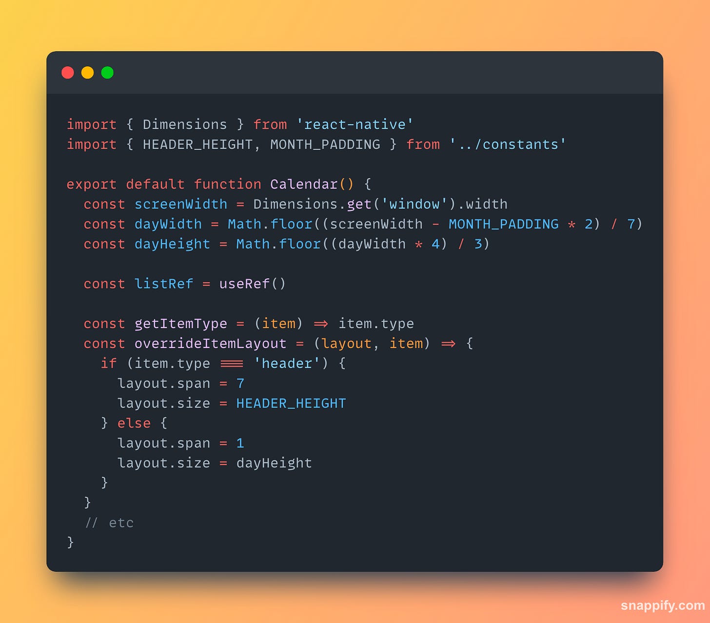
We determine the width of the day cells by taking the screen width, subtracting a constant for padding, and dividing by 7. All our images will have a 4:3 aspect ratio — the native aspect ratio of most mobile cameras — so we can derive the cell height from the width.
overrideItemLayout is where we tell the list to make the header cells 7 columns wide, while all other cells are 1 column. The documentation doesn’t seem clear on this, but I found the else block necessary; without it, the list would seem to render correctly, but its height would be calculated incorrectly by a very small amount when it contained a large number of rows, which was a frustrating bug to solve!
The rest of the Calendar component looks like this:
Specifying the initialScrollIndex ought to make the list start out scrolled all the way to the bottom, but I’ve found that this doesn’t work as expected. The onLoad function here is a hack to makes sure the list begins scrolled fully to the bottom.
From there it’s pretty straightforward. The CalendarDay component is essentially a switch statement that renders either a MonthHeader, DayWithImage, DayWithoutImage, or a spacer View based on the type property and whether data.image is populated.
For the sake of completeness, I’ve included a basic react-navigation setup so that pressing an image on the calendar displays it in a modal. The DayModal component wraps an Image and a Pressable in a BlurView so that pressing outside the image dismisses it.
The End
And there you have it! Images on a calendar. Simple in some ways, not so simple in others. Here’s the link to the demo again — feel free to fork it and add your own features. Some further ideas to consider, some of which I intend to write about in the future:
Using gestures to scroll between images or dismiss the modal
Keeping the calendar’s scroll state synced to the current image
Dealing with multiple images per date
Dragging to select images on the calendar
If you enjoyed this piece, please let me know, and don’t forget to check out phomo on the app store.


